Resource Map Upgrades
Moderator: Staff
Resource Map Upgrades
Included among the suggestions in the Open Letter was a statement whereby it was suggested that there is a need for upgrading certain outdated maps, such as the resource map. The original resource map was created using icons from the Civilization series. It has been outdistanced by what we can produce nowadays as far as quality is concerned. As a professional ecologist I've been working with Shyriath, who is the professional cartographer, to produce some upgraded maps based on Gloria Mundi and resource maps used in the real world. As static maps they won't need regular updating, so creating a complex map is not an issue as it simply needs the initial impetus to achieve completion.
To that end I wish to present the draft of two of what is intended to be a series of several resource maps that cover all aspects of natural resources on Micras. These define metal and agricultural resources.
https://dl.dropboxusercontent.com/u/181 ... Metals.png
https://dl.dropboxusercontent.com/u/181 ... ulture.png
Commentary is welcome and encouraged.
-
High King Harald
- Posts: 626
- Joined: Thu Jul 26, 2007 1:11 pm
- Location: Vanadísarhall, Haraldsborg, Gularike, Stormark.
- Contact:
Re: Resource Map Upgrades
Those maps look very good and very professional indeed.
Harald Freyjugjöf the Generous Giver of the House of the Descendants of Freyja
High King of Stormark
Sovereign Lord on all Continents
High King of Stormark
Sovereign Lord on all Continents
Re: Resource Map Upgrades
This promises to be quite spectacular. Keep up the good work!
Will the distribution of resources bear any resemblance to those of the old map, or will there be a complete reassessment from scratch based on the ecological factors you mentioned?
Will the distribution of resources bear any resemblance to those of the old map, or will there be a complete reassessment from scratch based on the ecological factors you mentioned?
Re: Resource Map Upgrades
The present map might be a useful guide for any resources that turn out not to be strongly influenced by ecological or geological factors - though none are springing to mind just at the moment - but otherwise, I think, there's no intention to be bound by it.
As far as aesthetics goes... I'm a little concerned about how cluttered the map would get once all the circles are placed and connected with lines, so if anyone has any suggestions on that score, please let me know.
A possibility I've been thinking about - and this occurred to me only within the last day or two - would involve building an interactive map, which would allow different displays depending on where the cursor hovers, but as this is a field I have only very limited experience with, it should be regarded solely as speculation for the time being.
By the hand of
Shyriath Bukolos, aka Shyriath Farstrider, Harbinger of Cheese
He who has been
Shyriath Bukolos, aka Shyriath Farstrider, Harbinger of Cheese
He who has been
-
Andreas the Wise
- Posts: 5024
- Joined: Sun Jun 24, 2007 8:34 pm
- Location: Novatainia
- Contact:
Re: Resource Map Upgrades
Looking very nice, and I think international trade has been non-functional for long enough that you can safely restart the resource maps without anyone getting too concerned.
I'm not sure whether the lines are necessary though - they will look messy once you're done, to be sure. Could you just put the different sizes of circle on the map directly?
(having said that, making lines appear when you hover over is pretty cool. One of my colleagues has been doing this at work with some google maps stuff - I think it's mainly just html/javascript code in the background that hides/unhides the lines)
Andreas
"He showed up three or four years ago and accidentally took over the micronational world by being way more competent and enthusiastic than everyone else. Now he sort of rules us all, but it's a benevolent sort of thing, as far as we know."
~Scott Alexander
"He showed up three or four years ago and accidentally took over the micronational world by being way more competent and enthusiastic than everyone else. Now he sort of rules us all, but it's a benevolent sort of thing, as far as we know."
~Scott Alexander
Re: Resource Map Upgrades
Possibly, though it would then be harder to compare circles of the same resource against one another, since they'd be sitting apart, on the various continents.I'm not sure whether the lines are necessary though - they will look messy once you're done, to be sure. Could you just put the different sizes of circle on the map directly?
So I believe, but I'm pretty much a total idiot at any HTML past the purest basics and any Javascript at all, and thus far I have remained so through all my amateurish attempts to learn either; when it comes to computer languages, the things I need to remember just don't stick in my head. I've acquired a program that, so far as I understand it, does that work for you, and in general it works; I just haven't explored what it's capable of in my hands yet.(having said that, making lines appear when you hover over is pretty cool. One of my colleagues has been doing this at work with some google maps stuff - I think it's mainly just html/javascript code in the background that hides/unhides the lines)
By the hand of
Shyriath Bukolos, aka Shyriath Farstrider, Harbinger of Cheese
He who has been
Shyriath Bukolos, aka Shyriath Farstrider, Harbinger of Cheese
He who has been

Re: Resource Map Upgrades
I want to start out with how slick that looks. It's pretty sweet, and I have no idea how you do it, which is a compliment as I really do try to increase my graphic arts skills to little avail. It looks like some infographic you'd find on Metapicture.
Now, on the old resource map there were rings of increasing scarcity of the resource, and I liked that, and would like to see that concept remain in some form. It went hand in hand with MITO's 'you have this much of that to trade with' which I liked. I miss MITO.
While I think it'd be pretty cool, I'm not sure how a mouse over would work. Might solve the problem with 'overlapping resources', especially if the resources taper off over large areas like mentioned above. Have a center dot and highlighting over that shows the whole spread of it. Or even better than a mouse over, have like check boxes or buttons down at the bottom of the map (the resources key) and then pressing the button causes all the regions of that particular resource to appear on he map! Oooor, you can just have a map for each resource, and a link to each with their areas.
I don't like the lines. Once you actually have more dots on the map it'll be a mad house. Maybe lines in conjunction with one of the clickable / mouse over options above. But I do like the abstract. How they are resource categories, giving the individual nations an opportunity to have some control over what kind of noble metal or fibrous material they have to offer.
I like how 'heavy industry' is not a resource, which always seemed a cultural thing to me, as well as hydro electric. But if you're looking at energy resources there's no oil, or coal, or propane, or methane or any of those fossil fuels that make the world actually work in a modern concept. I mean, whole wars have been fought over control of those kinds of resources; nations have been made and broken trading the stuff. Definitely needs to be included. Even if you just want to call it 'fossil fuels' and leave it abstract, as I endorsed above.
Finally, I really hope that the distribution of the resources is just an example for the sake of style, as I don't think that's a fairly equitable spread. People near the coasts get stuff too you know.
His Incomparable Highness,
His Matchless Grace,
His Majestic Honor,
His Eminent Splendor,
His Chivalrous Eminence,
The Rook
Lord Protector of Uantir
His Matchless Grace,
His Majestic Honor,
His Eminent Splendor,
His Chivalrous Eminence,
The Rook
Lord Protector of Uantir
-
Craitman
- FMS Staff
- Posts: 21547
- Joined: Sun Jun 24, 2007 7:37 pm
- Location: Cherry Trees, Craitland
- Contact:
Re: Resource Map Upgrades
I always feel that when I praise something in the first point of my reply, it looks like there's going to be a massive "but..." afterwards! Anyway, I love how professional these look; subtle colours, great lines and a nice choice of font 
I like Rook's nostalgia for MITO and the concentric display of resource scarcity though, and I think that could a feature to retain.
As for a mouse-over option, I'm not sure what the possibilities are, but I think the best approach could be to highlight the specific "dots-and-line" and negate the remaining ones to a shade of grey. I know it isn't a map, but this chart is what influenced my thinking
-
pawelabrams

- Posts: 3207
- Joined: Sun Jun 24, 2007 8:14 pm
- Location: Novograd, Interland
- Contact:
Re: Resource Map Upgrades
Hover stuff might as well be done without JavaScript these days 
But anyway, to the maps: too much lines has already been pointed out; but we can have a 'nth in the world' mark available on hover. We can even have all of the same type pop up the same moment to compare (OK, this one needs JS). I also liked the concept of scarcity levels, but I know that they would be hard on the technical side.
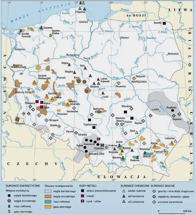
Another type of map that comes to my mind are Polish resource maps; we still have symbols - and sometimes scarcity marks, but they are much less cluttered, almost icon-like. I'm now wondering if this iconset is limited to former Eastern Bloc in usage.
Edit: see next post for an example.
But anyway, to the maps: too much lines has already been pointed out; but we can have a 'nth in the world' mark available on hover. We can even have all of the same type pop up the same moment to compare (OK, this one needs JS). I also liked the concept of scarcity levels, but I know that they would be hard on the technical side.
Another type of map that comes to my mind are Polish resource maps; we still have symbols - and sometimes scarcity marks, but they are much less cluttered, almost icon-like. I'm now wondering if this iconset is limited to former Eastern Bloc in usage.
Edit: see next post for an example.
Pavel' Abramovic:, the President of Interland
IRL just a random guy from Poland. Still learning English.
IRL just a random guy from Poland. Still learning English.
Re: Resource Map Upgrades
This is incredible work. I am incredibly impressed.
EDGARD
Central Committee of Edgards
- - - - - - - - - - - - - - - - - - - - - - - - - -
Currently involved in: New Alexandria, Natopia, Ransenar, Constancia
JOIN THE NOUVELLE ALEXANDRIE DISCORD SERVER!
Central Committee of Edgards
- - - - - - - - - - - - - - - - - - - - - - - - - -
Currently involved in: New Alexandria, Natopia, Ransenar, Constancia
JOIN THE NOUVELLE ALEXANDRIE DISCORD SERVER!
Re: Resource Map Upgrades
Got a link? I have no visual reference for what you're talking about.pawelabrams wrote:Another type of map that comes to my mind are Polish resource maps;
His Incomparable Highness,
His Matchless Grace,
His Majestic Honor,
His Eminent Splendor,
His Chivalrous Eminence,
The Rook
Lord Protector of Uantir
His Matchless Grace,
His Majestic Honor,
His Eminent Splendor,
His Chivalrous Eminence,
The Rook
Lord Protector of Uantir
-
pawelabrams
- Posts: 3207
- Joined: Sun Jun 24, 2007 8:14 pm
- Location: Novograd, Interland
- Contact:
Re: Resource Map Upgrades
I'm searching for them for quite a few hours now and I haven't found one to be a good example! Most of these I saw in an old encyclopaedia and it just seems that most maps that are made in Poland in the old style are just copyrighted material for educational use. Most of new maps that are copyable are using plain dots and fills, probably to avoid some bizarre copyright infringement suit about icons or a legitimate one about not showing the true sources of information provided 
Edit: this seems an good one, it might be from a Geography textbook, so my point about copyright infringement stands
http://4.bp.blogspot.com/-n0O5C19v7Io/U ... ur.min.jpg
It has colours, which doesn't really appeal to me, I much prefer old monochrome or dichrome lines and shades, found in PWN encyclopaedia (a shorter sister of Britannica, older versions have three pages about socialism, but beside that they're pretty accurate xD ). The symbols are mostly universal, though. Fossils are represented by hexagons and trapezoids, metals by squares, chemical-value rocks are triangles, building and other stone materials are diamonds. Agricultural maps would have more organically looking icons, but similarly simplified.
Pavel' Abramovic:, the President of Interland
IRL just a random guy from Poland. Still learning English.
IRL just a random guy from Poland. Still learning English.
Re: Resource Map Upgrades
Interesting.
His Incomparable Highness,
His Matchless Grace,
His Majestic Honor,
His Eminent Splendor,
His Chivalrous Eminence,
The Rook
Lord Protector of Uantir
His Matchless Grace,
His Majestic Honor,
His Eminent Splendor,
His Chivalrous Eminence,
The Rook
Lord Protector of Uantir
Re: Resource Map Upgrades
Since I'm minoring in GIS I've been taking a lot of mapping courses and subsequently creating a lot of maps. In reflection I think Proportional Symbols might be the best way to display the data, and keep it in its most simple form.
Re: Resource Map Upgrades
So just stick with variously-sized circles, or other symbology (I might be able to do actual icons, but circles would probably be cleaner) on the continents themselves?
That would allow a static map to be feasible, but I could still do an interactive map; the program I'm using lets you assign various elements to groups, and then create a legend with check boxes that lets you see (or hide) particular groups at any one time. In theory, I could put all the resource maps into one page and people could just switch between them.
That would allow a static map to be feasible, but I could still do an interactive map; the program I'm using lets you assign various elements to groups, and then create a legend with check boxes that lets you see (or hide) particular groups at any one time. In theory, I could put all the resource maps into one page and people could just switch between them.
By the hand of
Shyriath Bukolos, aka Shyriath Farstrider, Harbinger of Cheese
He who has been
Shyriath Bukolos, aka Shyriath Farstrider, Harbinger of Cheese
He who has been